

Restaurant Logo Design: The Silent Ambassador of Your Brand
Before a customer reads your menu, before they step through your door, before they even decide whether to give your restaurant a second glance, your logo has already spoken. It has told a story. Made a promise. Set an expectation.
That is the quiet but powerful reality of restaurant logo design. It is not just a graphic. It is the first handshake between your brand and the world outside.
For restaurant owners in the UAE; one of the most competitive and image-conscious dining markets on the planet, getting this right is not optional. Dubai alone hosts thousands of dining establishments, from casual street food spots in Al Quoz to fine dining venues along Dubai Creek. In a market this crowded, a well-designed restaurant logo is one of the clearest ways to tell customers why they should choose you over the place next door.
This article takes a deep look at why restaurant logo design matters more than most business owners realize, what separates a forgettable logo from a brand-defining one, and how UAE restaurant owners can approach this strategically, from concept to final execution.
Why Restaurant Logo Design Is More Than Just a Pretty Symbol?
There is a common misconception among first-time restaurant owners: that a logo is simply a nice-looking image you slap on your menu and signage. The reality is quite different.
Your logo is the foundation of your restaurant’s visual identity. Everything your customer sees; your packaging, your social media posts, your staff uniforms, your takeaway boxes is either going to strengthen or weaken the impression your logo creates. When the design is cohesive and intentional, it builds recognition. When it is inconsistent or poorly thought out, it creates confusion.
Think about the restaurants you remember most clearly. Chances are, their logos were not just visually appealing, they communicated something specific. A feeling. A promise. A personality.
The Psychology Behind First Impressions
Research in consumer psychology consistently shows that people form impressions within milliseconds of encountering a new visual stimulus. A restaurant logo is no different. Customers make instant, subconscious judgments about whether a restaurant is premium or casual, traditional or modern, authentic or generic, all before they read a single word about the food.
Colors, shapes, typography, and imagery all send signals to the brain. A serif font with gold accents says something very different from a bold, hand-drawn script on a rustic background. Neither is inherently better but both communicate something specific. The question is whether what they communicate aligns with what your restaurant actually offers.
The Connection Between Logo and Dining Decisions
In the UAE, where social media has become a major driver of restaurant discovery, your logo also functions as a digital touchpoint. A customer scrolling through Instagram or Google Maps is making split-second decisions about which restaurants are worth clicking on. A sharp, clear, well-proportioned logo signals credibility and care. A blurry, cluttered, or overly generic one signals the opposite.
This is not an exaggeration. A study by Nielsen Norman Group found that users judge website and visual credibility within 50 milliseconds. In the context of restaurant branding, your logo is often the very first visual element a potential customer encounters and that first impression is difficult to undo.
The Core Elements of a Powerful Restaurant Logo
Great restaurant logos do not happen by accident. They are the result of deliberate decisions made at every level of the design process. Understanding the building blocks of an effective logo helps restaurant owners ask the right questions and make better choices when working with designers.
Color Psychology in Restaurant Logo Design
Color is arguably the most emotionally loaded element of any visual design and in food branding, its impact is even more pronounced. Certain colors have a well-documented relationship with appetite, mood, and perception of quality.
Red and orange, for example, are widely used in fast food and casual dining because they are stimulating, energetic, and associated with hunger. Brands like McDonald’s, KFC, and Pizza Hut are not red by accident. Green, on the other hand, signals freshness, health, and sustainability which is why it dominates branding for organic cafes, salad bars, and health-focused eateries.
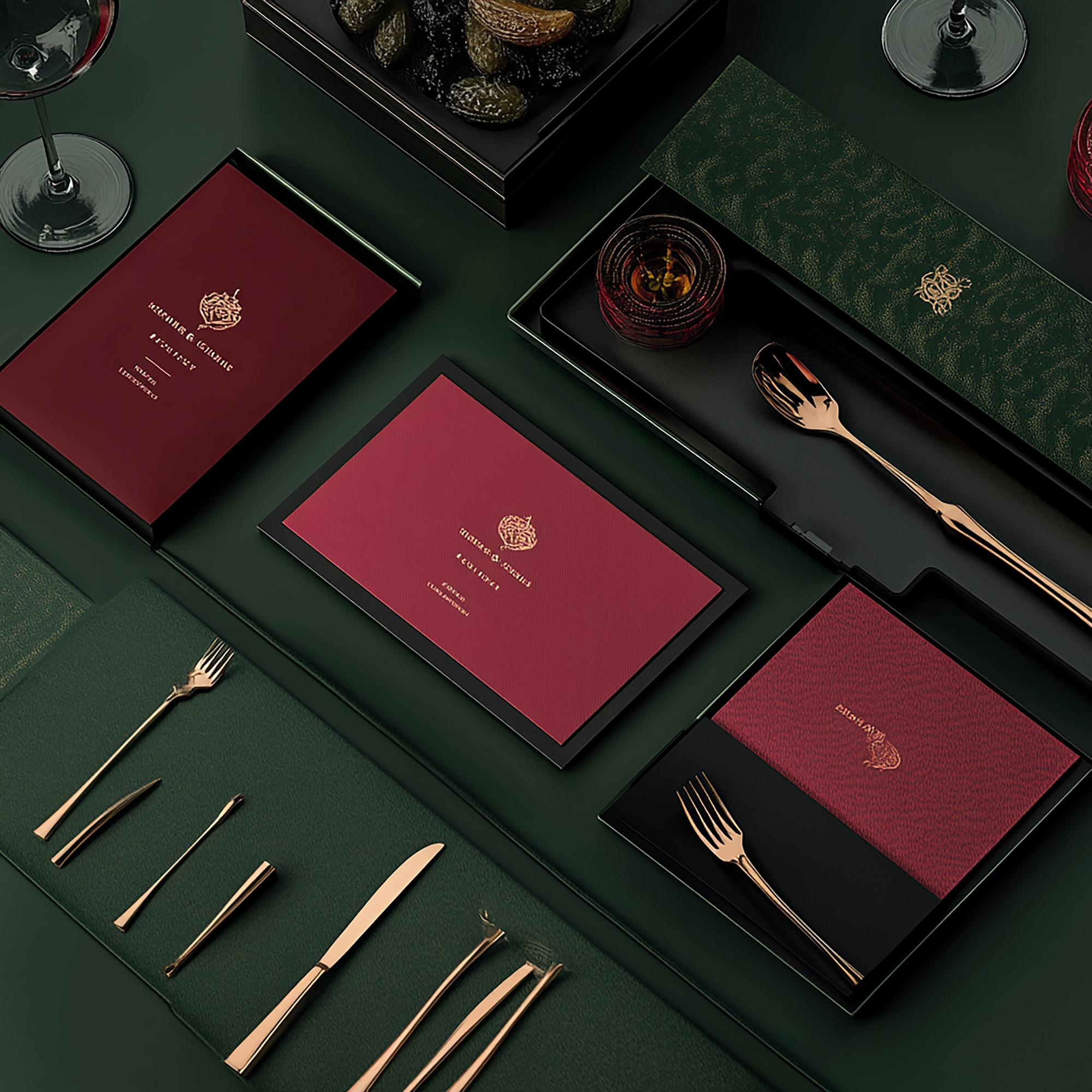
In the UAE market specifically, color choices carry additional cultural weight. White is associated with purity and simplicity. Gold conveys luxury and prestige which is why you will find it used extensively in high-end restaurants and hotels across Dubai and Abu Dhabi. Deep burgundy, navy, and olive tones tend to feel premium and sophisticated, fitting well within the UAE’s appetite for refined dining experiences.
When choosing colors for your restaurant logo, the question to ask is not just ‘Does this look nice?’ but rather ‘Does this color tell the right story about my restaurant?’
Typography — The Unspoken Voice of Your Brand
Fonts carry personality. This sounds like a creative exaggeration until you actually pay attention to how different typefaces make you feel.
A fine dining restaurant that uses a clean, elegant serif font immediately signals formality, tradition, and a certain level of seriousness. A trendy brunch café with a casual, hand-lettered script says something completely different approachable, creative, relaxed. A bold, geometric sans-serif on a modern fast-casual brand communicates confidence and efficiency.
For UAE restaurant owners, typography choice should also take into account bilingual considerations. Many menus, signages, and digital assets need to work in both English and Arabic. A logo design that integrates both scripts cohesively without one overpowering the other is a genuine branding asset in this market.
The most common mistake restaurants make with typography is choosing a font based purely on aesthetics without considering legibility at small sizes. A beautifully intricate script font might look gorgeous on a full-sized poster but become completely unreadable on a business card or app icon. Scalability is not optional, it is essential.
Symbols, Icons, and Imagery
Should your restaurant logo include an icon? Not always but when done well, a strong visual symbol can become one of the most recognizable elements of your brand.
The challenge with food-related icons is that the obvious choices; a fork and knife, a chef’s hat, a steaming bowl are so widely used that they rarely differentiate a restaurant from its competitors. The most memorable restaurant logos often use unexpected or abstracted imagery that still connects back to the brand’s story or cuisine.
For restaurants operating in the UAE, cultural symbolism can be a powerful differentiator. Elements inspired by Islamic geometric patterns, Arabian architecture, date palms, or desert motifs can create a distinctive visual identity that resonates with both local and international customers. However, this requires careful and respectful execution, which is why cultural awareness is a non-negotiable part of the design brief for any UAE-focused restaurant brand.
Simplicity and Scalability
The best restaurant logos in the world share one quality: they work everywhere. On a 50-meter building facade. On a matchbox. On a mobile app icon. On an embroidered uniform patch.
Achieving this level of versatility requires restraint. It means resisting the urge to include too many elements, too many colors, or too much detail. A great professional restaurant logo is usually made up of just a few well-chosen elements that work together to create a clear, distinctive mark.
If your logo needs to be simplified or altered significantly to work across different formats, that is a design problem, not a printing problem. A skilled food brand designer will build scalability into the logo from the very start.
How Logo Design Directly Impacts the Customer’s Brand Experience?
The phrase ‘brand experience’ gets used a lot in marketing conversations, but what does it actually mean for a restaurant? Simply put, it is the sum of every feeling, impression, and memory a customer takes away from every interaction they have with your restaurant — online and offline.
Your logo sits at the center of that experience. It is present at every touchpoint.
From the First Online Search to Walking Through the Door
Consider the customer journey of someone visiting the UAE for the first time and looking for a dinner spot. They open Google Maps, type in a cuisine preference, and scan the results. The first thing they see even before the restaurant name fully registers is your logo. If it is compelling, it earns a click. If it is generic or cluttered, it gets scrolled past.
Once they click through, your logo appears again on your website, your social media profile, your Google Business listing. By the time they actually visit your restaurant, they have already seen your logo multiple times. It has set the tone for what they expect to experience. Your interior decor, your menu design, your staff presentation, all of it either confirms or contradicts that expectation.
When the logo and the real-world experience align, customers feel a sense of coherence and trust. When they do not, there is cognitive dissonance, a subtle but real sense that something does not quite fit.
The Role of Your Logo in Digital Marketing
Social media has fundamentally changed how restaurants attract and retain customers, and nowhere is this more apparent than in the UAE. Platforms like Instagram, TikTok, and Snapchat are packed with food content — reviews, unboxings, dining reels, and restaurant recommendations.
In this environment, your restaurant logo appears in profile pictures, story highlights, branded content overlays, and packaging visible in customer photos. It becomes part of your visual marketing language. A clean, bold logo that reads clearly in a small circle, the standard format for social media profile pictures is a genuine competitive advantage.
By contrast, a logo that is illegible at small sizes or looks dated against modern social media aesthetics actively works against your restaurant marketing efforts.
Logo Consistency Builds Customer Trust
Consistency is what transforms a logo from a design element into a brand asset. When customers see the same logo, colors, and visual style applied consistently across your menus, signage, packaging, social media, and staff uniforms, it creates familiarity. And familiarity, over time, creates trust.
For example, using dynamic QR codes for restaurants to host your digital menu allows you to perfectly align the online interface with your physical branding. This seamless transition from scanning a beautifully branded QR code to browsing a customized digital menu reinforces the professional image your logo promises.
This is especially important in the UAE’s restaurant sector, where a significant proportion of customers both residents and tourists are encountering your brand for the first time through digital channels before they ever visit in person. A consistent, professional visual identity signals that your restaurant takes itself seriously. That attention to detail in the branding often signals attention to detail in the kitchen.
Restaurant Logo Design in the UAE — What Makes It Different?
Designing a restaurant logo for a UAE audience is not the same as designing one for a Western market. The UAE’s unique cultural, demographic, and aesthetic context requires specific considerations that many generic design templates and offshore agencies simply do not account for.
Understanding UAE Consumer Expectations
The UAE is home to over 200 nationalities, and its restaurant scene reflects that diversity. At the same time, there is a clearly defined local aesthetic sensibility one that values quality, attention to detail, and a certain level of visual polish.
UAE consumers, particularly in Dubai and Abu Dhabi, are exposed to world-class branding across every sector — retail, hospitality, finance, entertainment. The bar for visual quality is genuinely high. A logo that might pass without comment in a smaller market can feel visibly out of place in the UAE context.
This does not mean every restaurant needs a luxury branding budget. It means the thinking behind the logo needs to be intentional and the execution needs to be clean. Even casual dining and street food concepts in the UAE benefit from sharp, purposeful restaurant identity design.
Balancing Modern Design with Local Identity
One of the interesting tensions in restaurant branding is the balance between international design trends and local cultural identity. Many restaurant owners particularly those running concept restaurants targeting tourists and expats lean heavily into global aesthetics without acknowledging the local context at all. The result can feel generic, like a restaurant that could be anywhere.
Something as subtle as incorporating an arabesque-inspired pattern into the logo border, or choosing a color palette drawn from the natural landscape of the Emirates, can create that sense of place without the branding feeling forced or tokenistic.
The Bilingual Branding Reality
As mentioned earlier, bilingual branding is a practical reality for most UAE restaurants. Arabic is the official language of the UAE, and while English is widely spoken and understood, presenting your brand in both languages signals respect for the local culture and broadens your appeal.
Designing a logo that works in both English and Arabic requires a skilled designer familiar with Arabic typography, not just someone who can translate text. The spacing, weight distribution, and visual balance between the two scripts need to be carefully calibrated. When done well, a bilingual logo feels unified. When done poorly, it looks like two unrelated designs stuck together.
Common Logo Design Mistakes Restaurant Owners Make
Even with the best intentions, many restaurant owners end up with logos that undermine rather than support their brand. Understanding the most common pitfalls makes it easier to avoid them.
Following Trends Without a Strategy
Logo trends come and go. Minimalist logos were everywhere a few years ago. Before that, vintage and distressed textures were the default choice for any food brand trying to seem authentic. Now, bold retro typography and abstract geometric marks are having a moment.
There is nothing wrong with being aware of design trends but building your restaurant logo around a trend is a mistake that will cost you a rebrand within a few years. The goal is a logo that feels current without being trend-dependent. Timeless design is not boring design, it is disciplined design.
Ignoring Scalability and Versatility
A logo that only looks good at large sizes is not a finished logo. Before signing off on any restaurant logo design, it should be tested across a full range of applications: business cards, menus, signage, packaging, social media profile images, app icons, and embroidery. If it fails at any of these, the design needs refinement.
Overcomplicating the Design
More is rarely more in logo design. A logo with five colors, three different fonts, and a complex illustration might look impressive as a standalone artwork but it will be difficult to reproduce consistently, expensive to print at scale, and nearly impossible to read at small sizes. Simplicity is a strength, not a compromise.
Not Considering Cultural Context
This is particularly important in the UAE. Certain colors, symbols, and visual references carry specific cultural meanings that may not be obvious to designers unfamiliar with the region. Working with a designer who understands the UAE market or briefing your designer thoroughly on cultural considerations is not optional. It is a basic due diligence requirement.
Skipping Professional Design Help
The availability of cheap logo generation tools and online design platforms has made it tempting for restaurant owners to cut corners on logo design. This is one of the most costly shortcuts a new restaurant can take. A logo created in Canva or generated by an AI tool might look acceptable at first glance but it will lack the strategic thinking, originality, and versatility that a professionally designed logo provides.
Your logo is going to represent your restaurant for years. The investment in getting it right from the beginning is almost always cheaper than the cost of rebranding later.
A Step-by-Step Approach to Designing a Logo That Truly Represents Your Restaurant
For restaurant owners in the early stages of building their brand or those considering a refresh, here is a practical framework to guide the logo design process.
Step 1: Define Your Brand Identity First
Before a single design element is chosen, you need clarity on what your restaurant actually stands for. What is your cuisine? Who is your target customer? What feeling do you want people to have when they eat at your restaurant? What makes your dining experience different from the competition?
These answers form the foundation of your brand identity and every design decision should flow from them. A logo without this foundation is just decoration.
Step 2: Research Your Audience and Competitors
Study the visual branding of restaurants in your category and price point, both locally in the UAE and internationally. Not to copy but to understand what conventions exist and where genuine differentiation is possible. Pay particular attention to how competitor logos perform on social media and in digital search results.
Step 3: Choose Design Elements with Intention
Armed with your brand identity and competitive research, brief your designer clearly. Do not just say ‘I want something modern and clean.’ Say what emotions you want the logo to evoke, what values it needs to communicate, what customer you are designing for. The more specific your brief, the more useful the design output will be.
Step 4: Test Across All Touchpoints
Before finalizing any logo, test it rigorously across all the contexts in which it will appear. Print it small. Put it on a dark background. View it in black and white. See how it looks as a social media profile picture. This testing phase often reveals issues that look invisible on a design screen.
Step 5: Gather Feedback Before Finalizing
Show the logo to people who represent your target customer, not just your business partners or family. Real feedback from real potential customers is far more valuable than internal opinions. Ask specific questions: What does this logo say to you? What kind of restaurant does this make you expect? Does it make you want to visit?
When to Redesign Your Restaurant Logo?
Not every restaurant has the luxury of starting fresh. Many established restaurants in the UAE are operating with logos that were designed years ago, sometimes by a relative or a cheap freelancer and have simply outgrown them.
Knowing when a logo redesign is necessary is important. The signs are usually clear: the logo looks visibly dated compared to your competitors, it does not reproduce well on digital platforms, customer feedback suggests the brand feels inconsistent or unclear, or the restaurant has evolved significantly since the logo was first created.
How to Refresh Without Losing Recognition?
A logo redesign does not always mean starting from zero. For established restaurants with an existing customer base, an evolutionary refresh, updating the typography, refining the color palette, simplifying a complex illustration can modernize the brand without discarding the recognition that has been built over time.
The key is identifying which elements of the current logo are genuinely recognized and valued by customers, and which elements are simply habits. Change the habits. Protect the assets.
Some of the most successful restaurant rebrands in recent years have been almost invisible at first glance, a cleaned-up version of an existing mark that feels fresh without feeling unfamiliar. That is the gold standard for logo evolution.
Connecting Logo Design to the Bigger Picture of Restaurant Business Growth
A restaurant logo is not just a branding exercise. It is a business growth tool.
When your visual identity is strong, it makes every other marketing effort more effective. Your social media content performs better because the brand visuals are consistent and recognizable. Your packaging becomes a marketing asset because customers share photos of it. Your restaurant attracts press and influencer attention more easily because the brand looks polished and intentional.
The lessons learned from working with UAE businesses in food, retail, and hospitality; show a clear trend: restaurants that focus on their brand identity early on gain customers quickly, keep them longer, and can charge higher prices compared to those that don’t prioritize branding.
For UAE restaurant owners specifically, where word of mouth spreads fast across WhatsApp groups, Instagram stories, and community platforms, a strong brand identity gives your most loyal customers something worth sharing. It is the visual shorthand for everything your restaurant represents.
As your restaurant expands internationally or opens new franchises, implementing scalable QR code solutions for growing businesses ensures your visual identity remains intact while delivering localized promotions and menus. This centralized approach guarantees that no matter which country a customer scans your branded QR code from, they experience the same high-quality brand consistency.
This is why The Next Grow consistently emphasizes that branding and logo design in particular should be treated as a foundational investment, not an optional expense to be minimized at launch.
Key Takeaways for UAE Restaurant and Café Owners
If you are a restaurant owner or an entrepreneur planning to enter the UAE’s competitive dining market, here is what matters most when it comes to restaurant logo design:
- Your logo is a business asset, not just a visual. It communicates your brand’s values, sets customer expectations, and builds recognition over time.
- Color, typography, and imagery all carry meaning. Every design choice should be intentional and aligned with your brand identity.
- The UAE market requires specific cultural sensitivity. Bilingual branding, cultural symbolism, and local aesthetic expectations are all part of the design equation.
- Scalability is non-negotiable. Your logo must work equally well on a building sign, a takeaway cup, and a social media profile picture.
- Avoid trends in favor of timeless design. A well-designed logo should serve your restaurant for years not just until the next design trend cycle.
- Professional design is an investment, not an expense. The cost of getting it wrong and rebranding is almost always higher than doing it right the first time.
- Logo consistency builds trust. The more consistently your logo appears across every customer touchpoint, the stronger your brand recognition becomes.
Your Logo Is the Beginning of Every Customer Relationship
The journey from a customer’s first glance at your logo to their first bite of your food is shorter than you might think. In competitive markets like the UAE, where dining choices are almost infinite and attention spans are shorter than ever, that journey happens in seconds.
A great restaurant logo does not guarantee great food or great service. But it opens the door. It makes a promise. It signals that the people behind this restaurant care about the experience they deliver before the first order is even placed.
Whether you are launching a new restaurant in Dubai, refreshing a café concept in Abu Dhabi, or repositioning an established brand for a new audience, the logo is where the conversation with your customer begins. Make it count.
For restaurant owners ready to build a brand that goes the distance, one where the visual identity is as strong as the menu, the work starts with the logo and extends to every touchpoint your customer encounters. That is a journey worth taking seriously.
